LOGOS have become part of our culture. Have you ever wondered WHAT MAKES A LOGO SPECIAL?
A good logo takes time to come up with. It must be distinctive, appropriate, practical, graphic, simple and be able to inform and convey an intended message at a glance . I hope that I’ve been able to express all of that in my logos.
There are five principles that you should follow to ensure that this is so…
1) SIMPLE
A simple logo design allows for easy recognition and allows the logo to be versatile & memorable. Good logos feature something unique without being overdrawn.

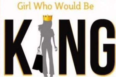
Blog logo: I’m Female, my last name is KING, I like to RULE! Oh; and be worshipped (hee, hee). Makes perfect sense!
2) MEMORABLE
Following closely behind the principle of simplicity, is that of memorability. An effective logo design should be memorable and this is achieved by having a simple, yet, appropriate logo.
3) TIMELESS
An effective logo should be timeless – that is, it will endure the ages. Will the logo still be effective in 10, 20, 50 years?
Probably the best example of a timeless logo is the Coca-Cola logo… if you compare it to the Pepsi logo, you can see just how effective creating a timeless logo can be. Notice how the Coca Cola logo has barely changed since 1885? That is timeless design.
4) VERSATILE
One way around creating a versatile logo is to begin designing in black and white only. This allows one to focus on the concept and shape, rather than the subjective nature of colour. One must also remember printing costs – the more colors used, the more expensive it will be for the business over the long term. An effective logo should be able to work across a variety of mediums and applications. The logo should be functional. For this reason a logo should be designed in vector format, to ensure that it can be scaled to any size. The logo should be able to work both in horizontal and vertical formats.
5) APPROPRIATE
How you position the logo should be appropriate for its intended purpose. For example, if you are designing a logo for children’s toys store, it would be appropriate to use a childish font & colour scheme. This would not be so appropriate for a law firm.
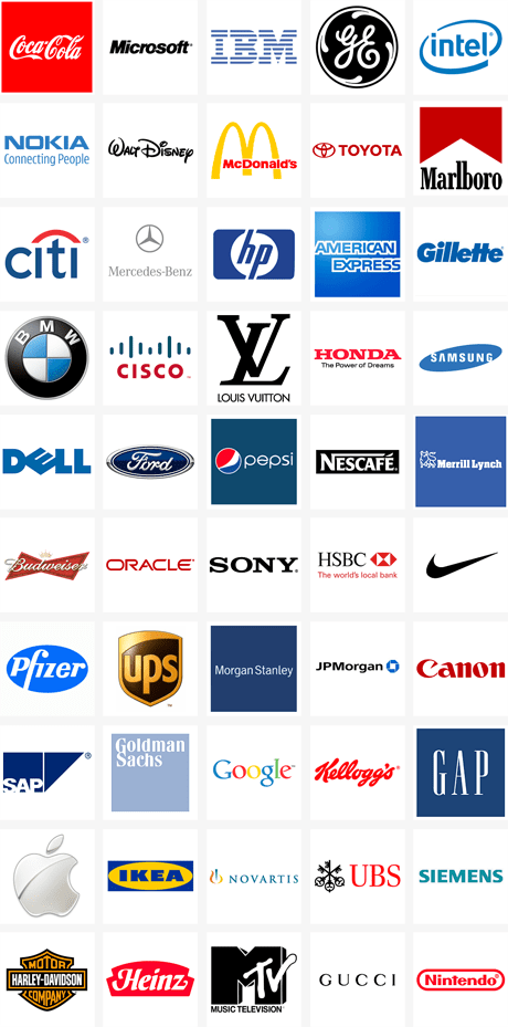
It is also important to state that a logo doesn’t need to show what a business sells or offers as a service. ie. Car logos don’t need to show cars, computer logos don’t need to show computers. The Harley Davidson logo isn’t a motorcycle, nor is the Nokia logo a mobile phone. A logo is purely for identification. For further evidence of this, take the top 50 brands of the world – 94% of the logos do not describe what the company does.
Things you may not have noticed before:
What’s so special about the amazon logo? Look at the arrow, it goes from A to Z.
 This is the FedEx logo, it is quite common. What’s so interesting about it? Look at the E and the small X, you are now noticing the arrow inbetween the E and the X. Then look over at the word Fed, if you look at the small E, you see a spoon. You’re’ being “Fed,” get it?
According to the ‘Top 100 Global Brands Scoreboard’ the top 50 brands & logo designs in the world are, in ranking order:
Coca-Cola, Microsoft, IBM, GE, Intel, Nokia, Walt Disney, McDonald’s, Toyota, Marlboro, Mercedes-Benz, Citi, Hewlett-Packard, American Express, Gillette, BMW, Cisco, Louis Vuitton, Honda, Samsung, Dell, Ford, Pepsi, Nescafé, Merrill Lynch, Budweiser, Oracle, Sony, HSBC, Nike, Pfizer, UPS, Morgan Stanley, JPMorgan, Canon, SAP, Goldman Sachs, Google, Kellogg’s, Gap, Apple, Ikea, Novartis, UBS, Siemens, Harley-Davidson, Heinz, MTV, Gucci and Nintendo.
Credit: JustCreative.com Jacob Cass does personal branding. He is responsible for the graphic art on Jerry Seinfeld’s show “Comedians In Cars Getting Coffee” – an excellent web series.
How NOT TO Design a LOGO: http://www.webdesignerdepot.com/2009/01/how-not-to-design-a-logo/
















You must be logged in to post a comment.